# Card 卡片
将信息聚合在卡片容器中展示。
# 基础用法
包含标题,内容和操作。
卡片名称
列表内容 1
列表内容 2
列表内容 3
列表内容 4
复制代码
# 简单卡片
卡片可以只有内容区域。
列表内容 1
列表内容 2
列表内容 3
列表内容 4
复制代码
# 带图片
可配置定义更丰富的内容展示。
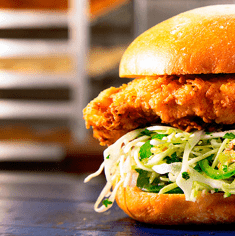
好吃的汉堡
好吃的汉堡
复制代码
# 卡片阴影
可对阴影的显示进行配置。
总是显示
鼠标悬浮时显示
从不显示
复制代码
# Attributes
| 参数 | 说明 | 类型 | 可选值 | 默认值 |
|---|---|---|---|---|
| header | 设置 header,也可以通过 slot#header 传入 DOM | string | — | — |
| body-style | 设置 body 的样式 | object | — | { padding: '20px' } |
| shadow | 设置阴影显示时机 | string | always / hover / never | always |